
UX and Government
Working with government clients to provide end users with the best possible user experience.
Some Context
Roles & Contributions:
Prototype Designer, UX Strategist, Demo Presenter, Workflow Creator
Stakeholders & Collaborators:
End Users, IT Transformation Specialists (client), Product Owner Representative, Technical Lead
Platforms:
Salesforce, S-Docs
Business Affiliates:
Booz Allen Hamilton | employer
Federal government agency | client
The Challenge
Our team - using an Agile scrum structure - provided enhancements to a Salesforce platform, for a government client. We were tasked with building a new feature that would enable users to complete more tasks within the platform. The problem we were solving for was how to bring the processes of creating unique, data rich documents within the platform. It was important to solve this problem because at the time end users were forced to manually author documents in Microsoft Word, waisting substantial time, causing inconsistencies, and providing no oversight. Across two phase, our team had to deliver a new letter generation feature that would fulfill goals set by our team, the clients, and the users.
Client Goals
The finished product should require as little customization as possible while being an improvement on the established processes and requiring minimal training.
Team Goals
The finished product should be something that is foundational for future growth, mirror established experiences in the application, and should not duplicate data.
User Goals
The finished product should simplify a tedious process, work for all niche/suboptimal user scenarios, and allow for file oversight across users.
The Users
Agents
“As an agent who needs to move this claim through the process, I need a way to create multiple documents for each claim - using the most recent data - so that I can have factual documentation without spending all day on this repetitive task.
Supervisors
“As a supervisor who is responsible for troubleshooting problems with the claim, I need a way to view and and manage the files, so that I can identify any sources of errors within them. ”
Phase One
At the start of this project, the team was given acceptance criteria by the client for a user interface that would allow users to generate PDF files within the Salesforce application. With past projects, the team may have taken the AC, ironed out any feasibility issues, run and then committed to the work, only using wireframes as a visual aid of the prescribed functionality. We needed to break from that mold when it became clear that the acceptance criteria would not fulfill the client and user goals. I introduced new UX and UI practices to help the team develop a new feature would serve all of the stakeholders’ needs.
The team needed to approach the planning strategically, setting a firm foundation for all the following PDF generation features. My contribution as a UX Designer and Strategist was integral for working through all the available options and aligning the team and clients to a shared vision.
UX Contributions
Making Sense of the Process
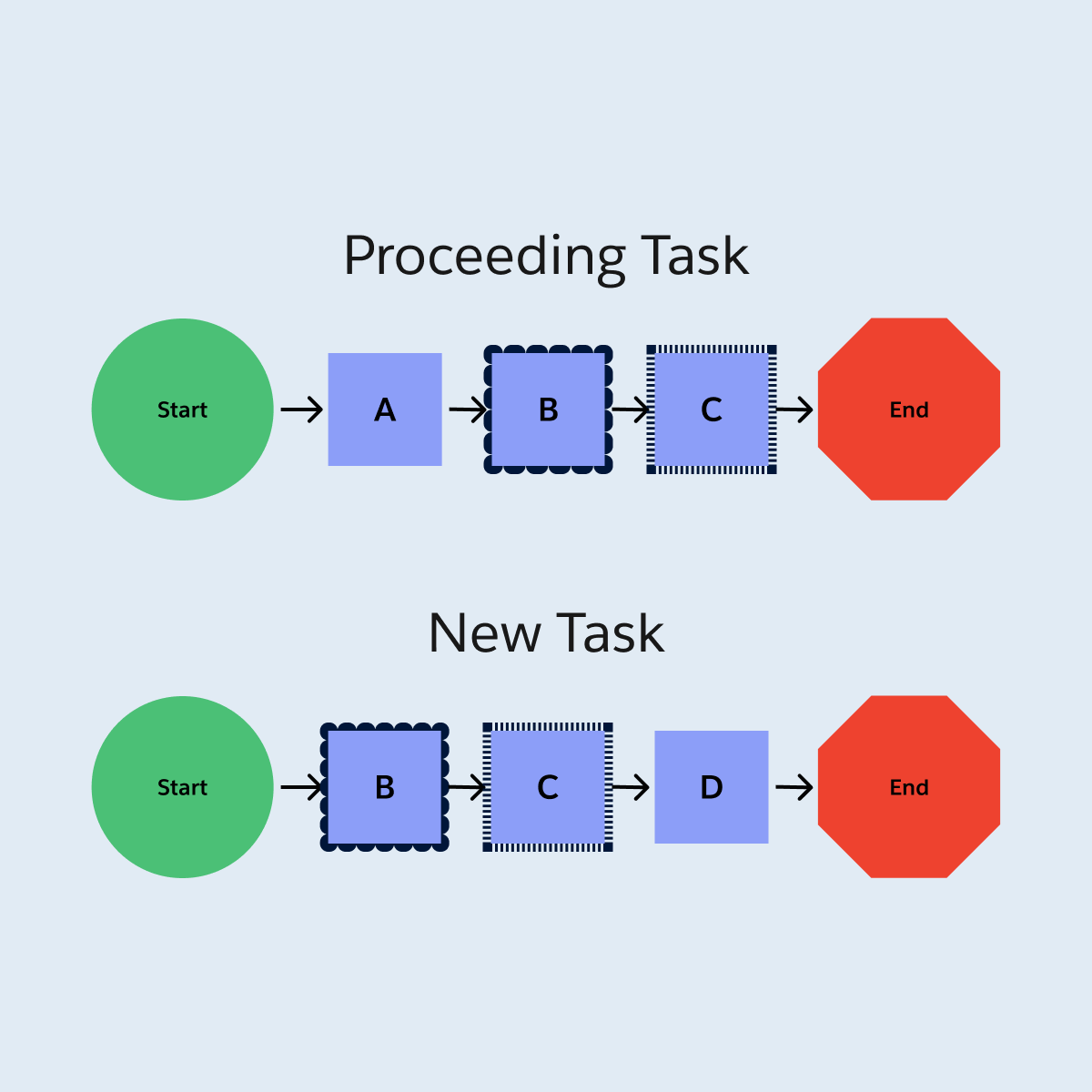
Following the steps outlined in the AC, I found the process confusing and redundant in places. In order to visualize the complexity, without getting sidetracked by UI details, I created workflows for the process, as well as tasks that a user would complete around the same time. They illuminated how users would repeat decisions and data entry that they already completed in the proceeding tasks on the case. The workflows were valuable assets for showing wasteful steps in the process, and getting buy-in from the product owner to explore more efficient processes with the same outcome.
Collaborating as a Team
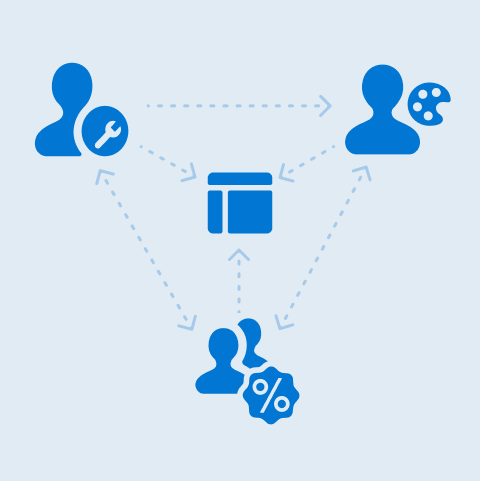
No one person had all the answers about the platform, user needs, or client priorities which were necessary for a successful product. I advocated for the user needs and consistency, the Technical Lead knew what our Salesforce platform and the S-Docs file generation plugin were capable of, and the Product Owner knew the client’s priorities. We came together regularly to review the work in progress prototype, share knowledge, and bring new ideas. Meeting regularly streamlined the process and ensured that no single contributor got too attached to a, idea that was not feasible. The end product was a feature the team was excited about, not something we just pushed out the door.
Determining the Best User Interface Design
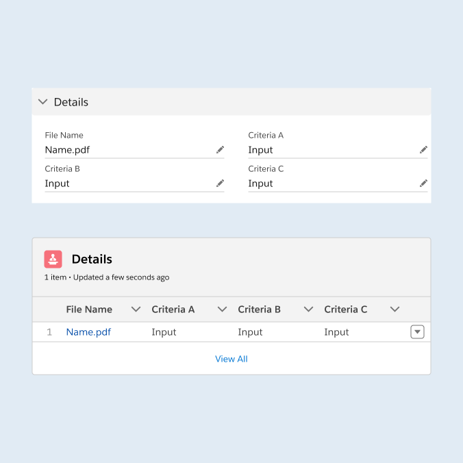
Rapid iteration was key to exploring all of the UI options and arriving at the best one. I started by building the UI according to the AC, following the patterns and information architecture of the platform in production. From there I provided options that included suggested changes that better adhered to UI best practices or human behaviors. My collaborators appreciated having the options to compare, along with explanations of the strengths and weaknesses of each option. The end product was stronger than the original idea. It provided the same outcome that the AC asked for, while reducing steps and the amount of custom components, presented with an uncluttered interface.
Getting Client Approval
After I created an interactive prototype, using Figma, I presented the design to the clients using the perspective of a user archetype. They provided feedback on naming conventions, their expectations on how they expected a history tracking feature to work, and data needs that were not met with the storage feature. The team iterated on the design further, using the context that they provided to better make decisions about how the process would be set up and presented to end users. The visuals that the prototype provided were invaluable. Multiple clients communicated that they were visual people, as we used the prototype as a tool during epic elaborations. Our expectations aligned with the clients and the proposed work was approved and ready for development.
Phase Two
Phase one of the project had been launched to users. They completed training and were putting the tool to use. It was time to deliver on phase two. The goal of this phase was to expand the application of the generation feature to more user scenarios, which would involve extra pieces of info, and more decisions for the users to make.
We needed to build off of what was established in the first phase. Consistency in the experience would mean that users would need minimal re-training in order to learn the process. I helped the team make tough decisions about how how to build an experience that reinforced their knowledge of phase one that required a low level of effort to deliver.
UX Contributions
Adding New Steps
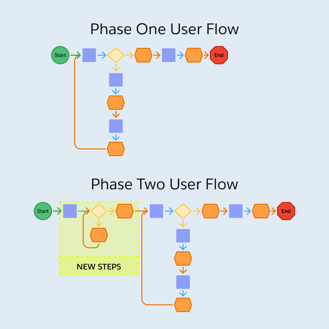
The next phase required additional pieces of info to generate the PDF. The system already stored those data points, so the user was only burdened with one additional decision step. There were many places in the application where this decision could have been added, and we were at risk of decision paralysis. After multiple rounds of brainstorming and reviews, I had created 7 versions of a workflow that captured where it could go and the ripple affects it would have on UI elsewhere. The final decision was a process where the new steps were slotted right at the start of the phase one flow, using a custom built component. We exhausted all other avenues and felt confident that this was the most straightforward and efficient option.
Documenting Decisions

I kept thorough notes about each workflow, including pros and cons. Originally this was for my own benefit but it became indispensable to the team. During development, a Product Owner pointed out a missing piece and became alarmed. I was able to return to my notes on the team’s decision. We had made that decision knowing that the piece was missing because we believed that the work around - which was captured in the notes - was acceptable. I was able to point the team to these notes and prevent collective spiraling. Documenting the “why’s” of decision making prevented costly reworking and grief.
Designing Custom UI
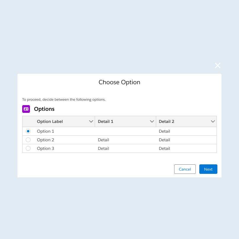
Going the custom route was preferred because of how we needed to set up the generation feature. Using UI that was not out of box was not preferred. I worked with the Technical Lead to determine what UI was feasible and how it would look in the end. He would tell me that radio buttons were do-able with extra steps and I would tell him how radio buttons better suited user needs. With his help I was able to create a prototype for custom UI that was intuitive to users, simple to build, and could withstand Salesforce design system updates. We worked out all UI the details so that developers could work from clear AC and a visual aid.
Getting Client Approval

The Product Owner demo-ed the prototype to the clients, including contextual information about our decision making (including the trade off with the missing piece from earlier). The clients raved about the prototype and made no requests for changes. “I have never seen that happen before”, commented the Lead Product Owner. The project received approval with celebration and development work started immediately.
-
This client review meeting was the only one that I have ever missed, due to technical difficulties. I trusted the Product Owner to present the demo effectively, but was going crazy not knowing how the client received the work. The team passed on the positive feedback I was able to retro-actively hear the client’s praise. I had never seen any gifs grace the chat of these serious government meetings, but one of our clients posted this. I will never be over this.
The Value of UX
Through significant collaboration, exploration, and outcome orientation, we delivered a feature that improved upon the previous, tedious process, is flexible to niche user scenarios, and can be built upon in the future. End users who reviewed the final product were excited to get their hands on it and leave behind the old way of doing things. Without UX involvement, the project would not have had any barriers to delivering what the client required, but the UX methodologies I employed helped us confidently find the best solutions for the users.
Collaboration
“Our Tech Leads and our UX designer worked very hard at making sure the user experience for this as very consistent, but also allowed us the flexibility we need.”
Product Owner
Exploration
“Thank you everyone. I know this was really painful and a very very long process to whittle down - the volume, quantity, content, everything… Thank you for your tenacity to stick with it”
Client
Orientation
“I have been waiting for these letters since 2009, when I started… it was like the Olympics that had never ended and now we have lit the cauldron. So thank you.”
End User
Reflections & Learning
This project was challenging for our team, but working through all of the ways in which we could have possibly solved the problem was rewarding. I learned lessons from working with my team that I implemented immediately because I saw the value of doing so (or the consequences if not).
Document Everything
Tracking notes on every little change or decision is easily my least favorite task, but it will save your bacon. With all of my tickets I take an extra moment to include the “why’s” of what I did, because otherwise the team is likely to forget and repeat work.
Check with the Tech Leads
Tech Leads will always have answers on what the system can do, but that’s not all they can do. The TL provided suggestions and new ideas, using UI I didn’t know existed. This taught me to seek out their opinions more frequently.
Stray from the Happy Path
Prototyping the UI was largely smooth sailing, but back-tracking happened when we realized we needed visuals of error messaging in places. This opened my eyes to making sure that the worse case scenarios are planned for.