Dashboard Research
Creating and evaluating a dashboard that keeps users informed of the health and performance of their tools.
Some Context
Roles & Contributions:
Project manager, UI Designer, Test Moderator, Data Analyst, Presenter
Fellow Collaborators:
3 Developers
1 Scrum Master
1 Product Owner Representative
Research Categories:
Evaluative
Business Affiliate:
Booz Allen Hamilton
Project Timeline:
5 (non-consecutive) sprints
High-Level Research Goals
Uncover further data needs - "What's missing?"
Understand what feature or piece of data is the most valuable for users.
Identify patterns of usage related to user competencies or tasks.
The Challenge
The development group uses a lot of environments, it's difficult to track down information across all of them. Going into each environment to regularly check and compare data is inefficient for development group members.
Problem Statement
As a development team member, I need a convenient way to assess the real-time health and properties of the environments at a glance so I can be well informed of the state of the environments as I complete my tasks.
The Users
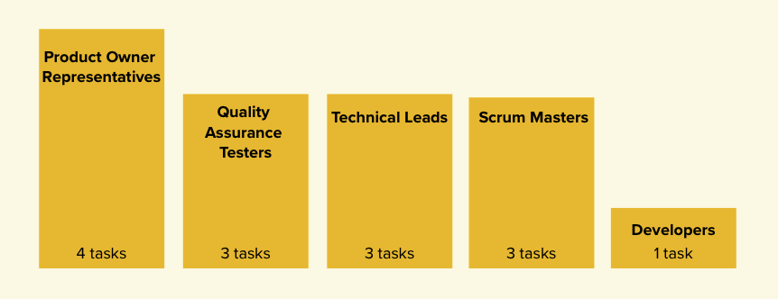
The team identified which disciplines within the development group were in need of a dashboard tool. I reached out to Product Owner Representatives, Technical Leads, Quality Assurance Testers, Scrum Masters, and Developers and found that the different disciplines had varying amount of tasks that involved data about the environments. We wanted to make sure that we involved each discipline in our research and that we prioritized features that contributed to the most common tasks across the disciplines.
Phase One
I was approached by the development team because they knew that creating a dashboard would solve problems for the end user, but they didn’t have direction on how to build the UI or make decisions about the details about the features of the dashboard. In the first phase of the research, I helped to break the nebulous open road ahead of them into small, actionable steps. I introduced the development focused team to research activities, lead them through each step of the process, and produced a wireframe for them to base the dashboard development on.
User Surveys
The team sent out a 10 minute survey, including the initial ideas for features that the dashboard should include, that asked users to rate each idea out of 5. The survey was sent to the development group, and we received 7 responses. The responses validated the team's initial ideas, and helped us prioritize where we should place our focus initially.
Lightning Demos
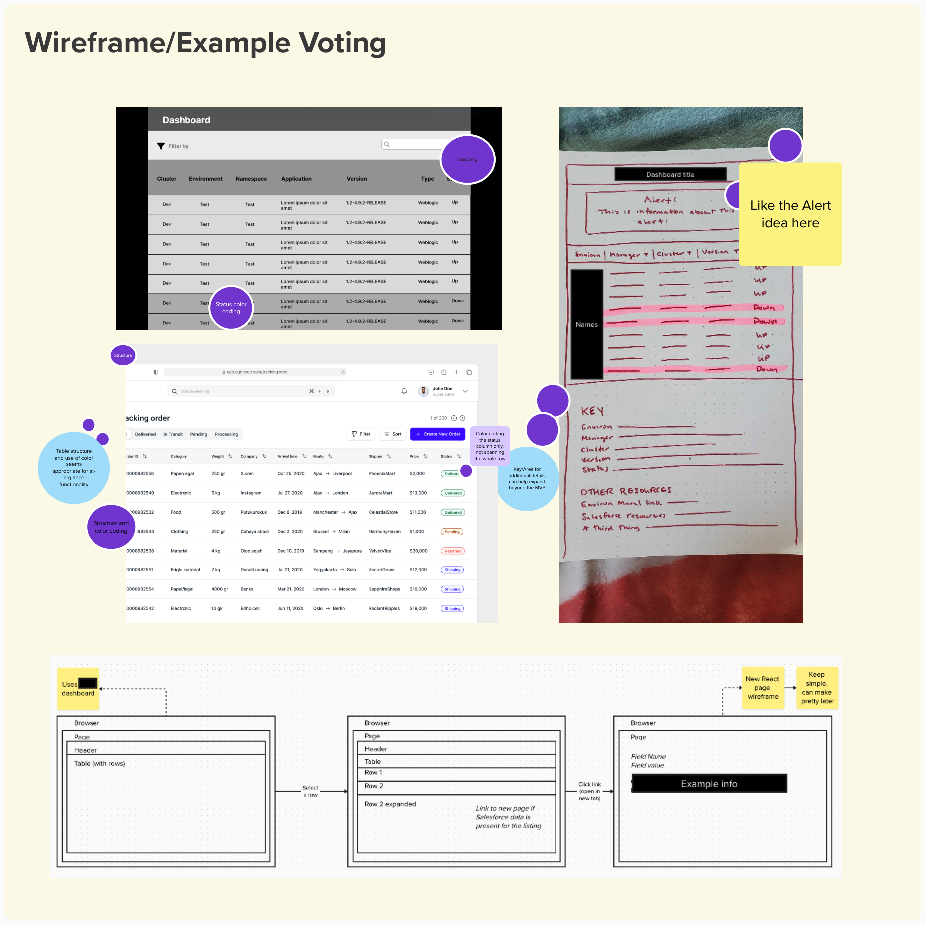
The team collected examples and mockups of how they pictured the dashboard. Everyone voted on the strongest features and layouts. As a result, the team was aligned behind key features and feasibility was discussed early on.
Mid-Fidelity Wireframe
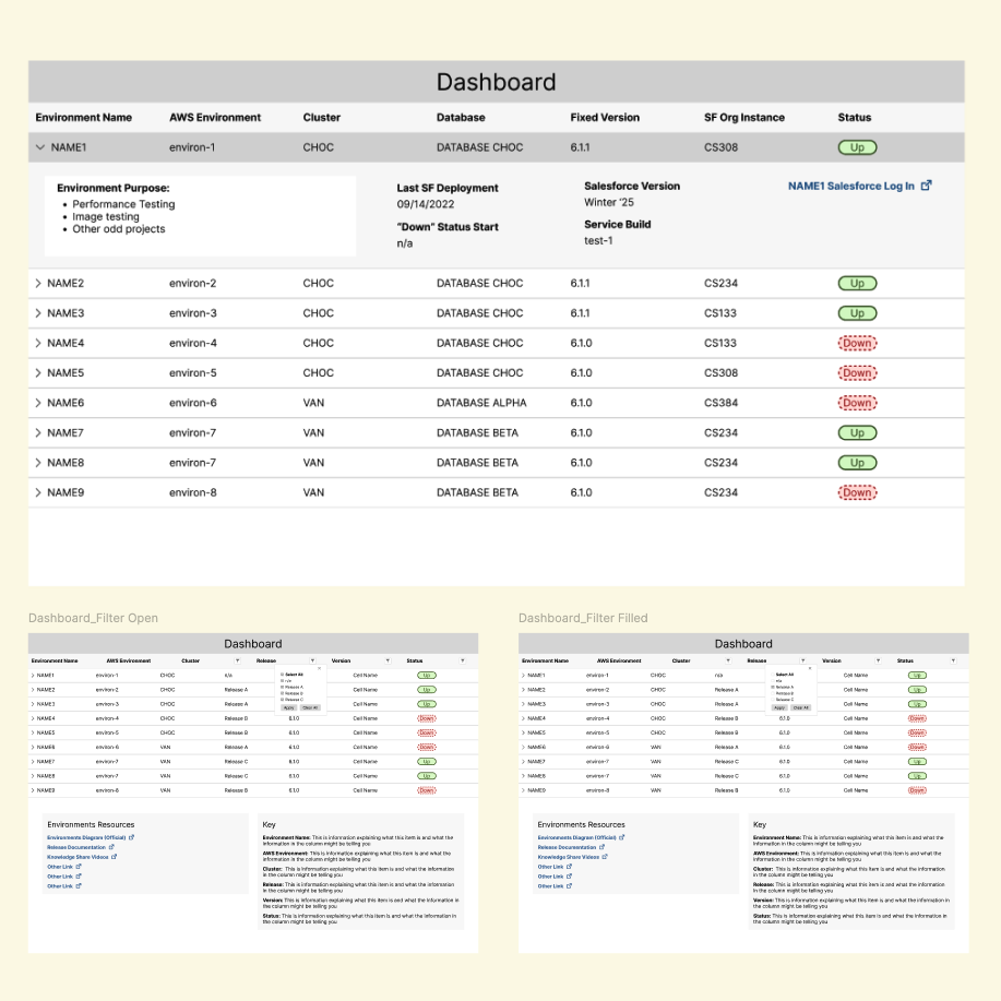
With the visual aids and prioritized features established by the team, I created a mid-fidelity wireframe, using the USDWS design style guide for development simplicity and 508 compliance. The wireframe served as a resource for user testing and early development.
Unmoderated Usability Testing
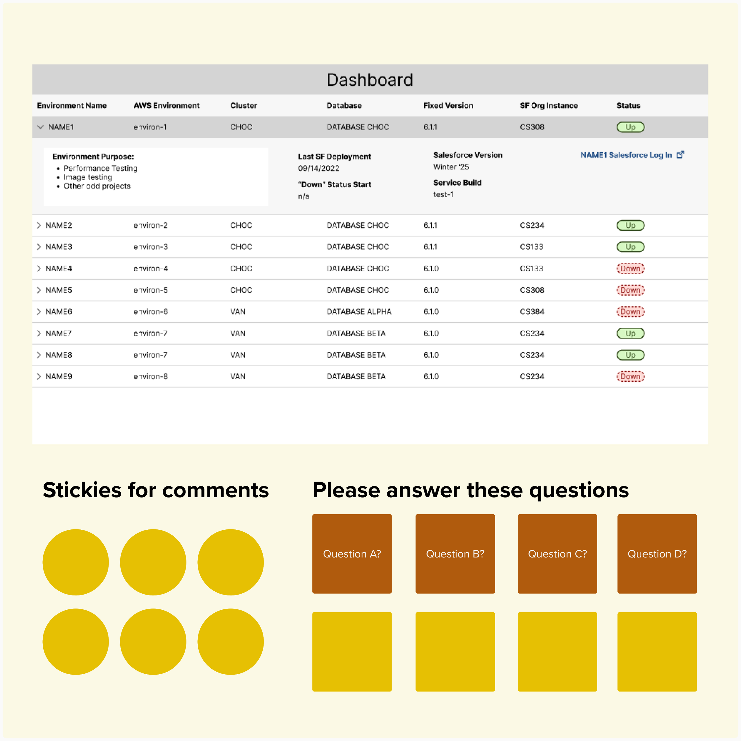
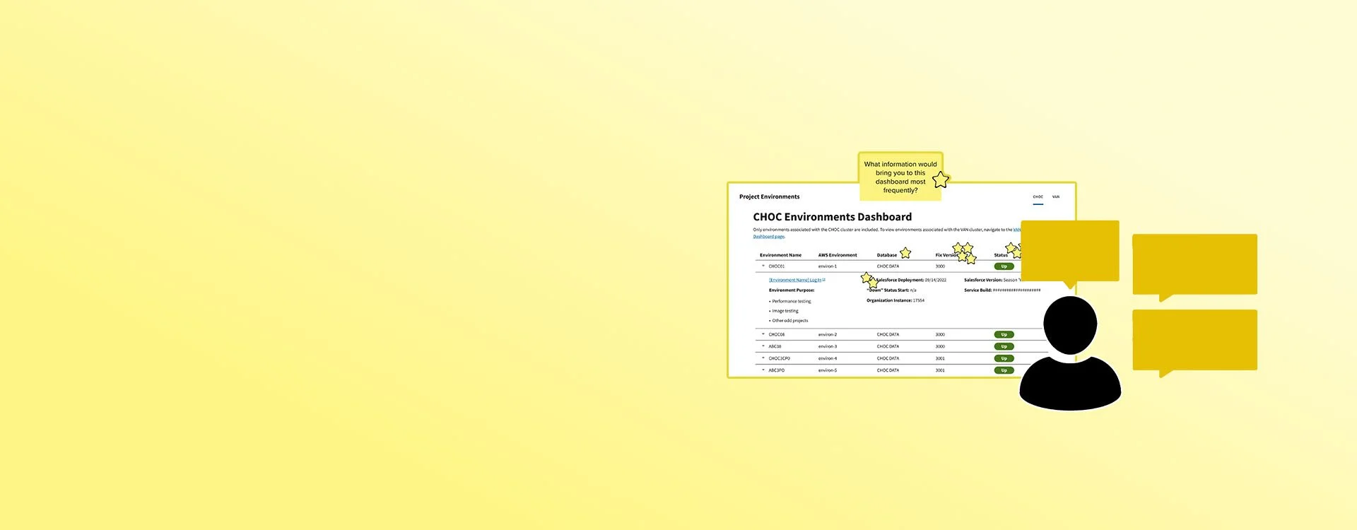
The wireframes were shared with development group members with prompts and questions to collect their feedback. We needed to know if users could interpret the data labels we wanted to know how they'd use the data. We received answers to our questions, with minimal time and resources spent by testers and our team.
Data Synthesis
I consolidated the test responses and identified user pain points, suggestions, and opportunities. I presented the findings to the team and we worked together to prioritize feasible UI updates. The developers were able to immediately research UI implementation and deliver a functional prototype in record time.
Phase Two
At this stage of the progress, the dashboard had been built, tested, an launched to the development group, however, the team felt like their work had been sent into a black hole. They had no idea if team members were using it or if it was successful. The focus of this phase was evaluative research. I introduced the team to research activities and included them so that they could see the impact their work had, and empathize with the end users. At the end of this phase, the team had identified enhancements for the dashboard and were excited to return to the project.
User Surveys (Part 2)
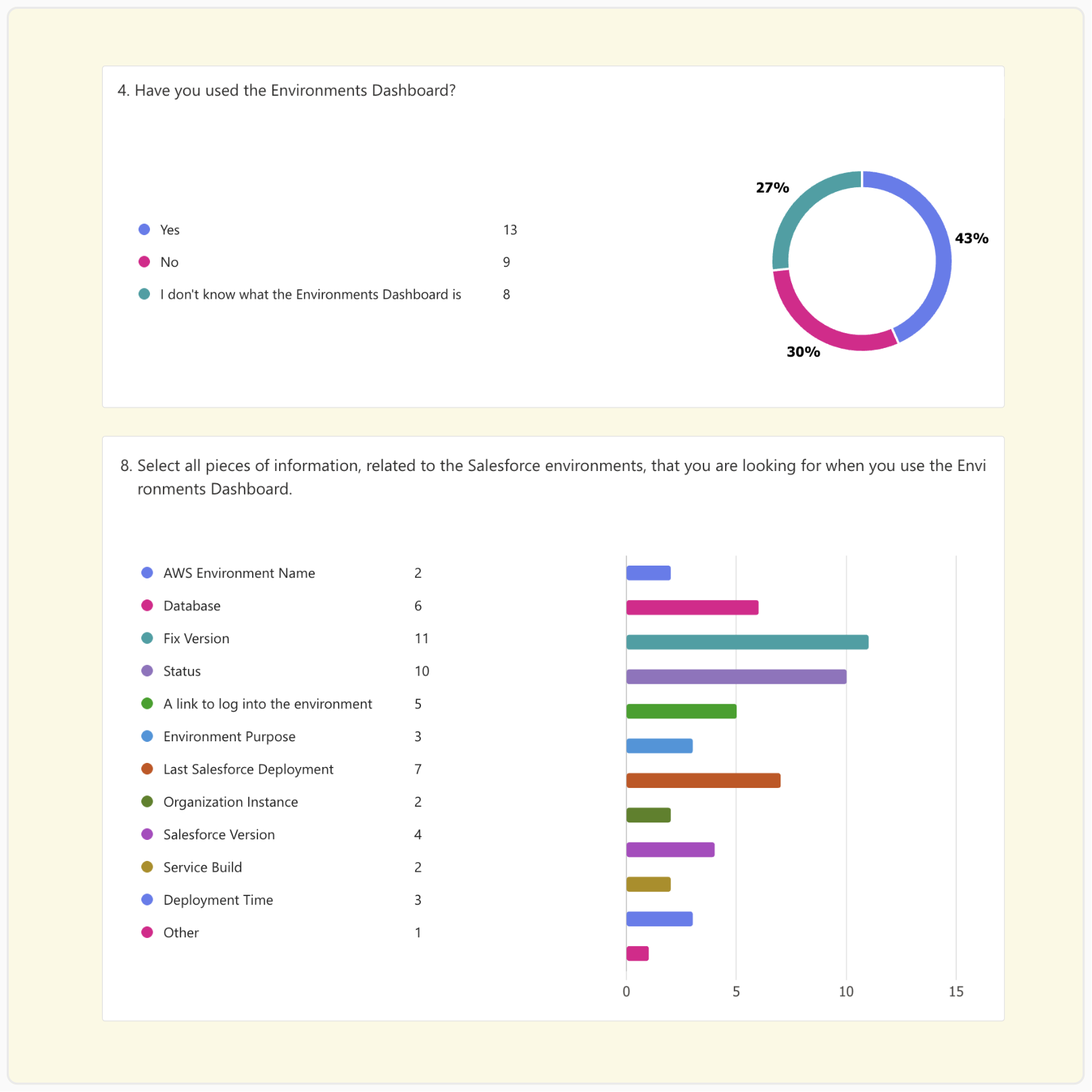
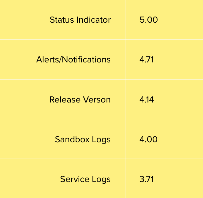
The team needed quantitative information on the usage of the dashboard, by the development group. I sent a 10 minute survey to all the members, and received 29 responses. With a substantial sample size, were able to draw conclusions about the dashboard usage across the target group.
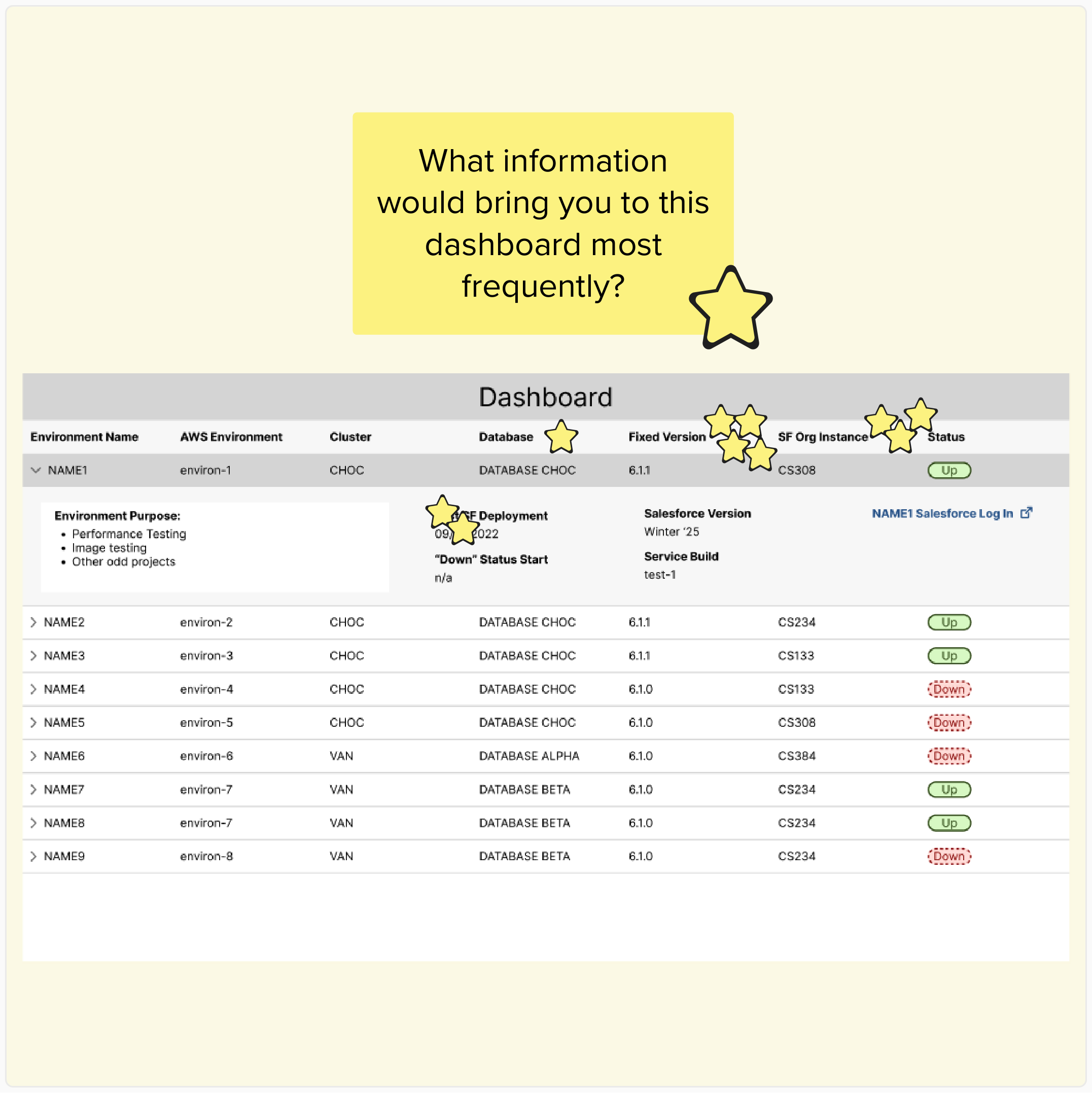
Moderated Usability Testing
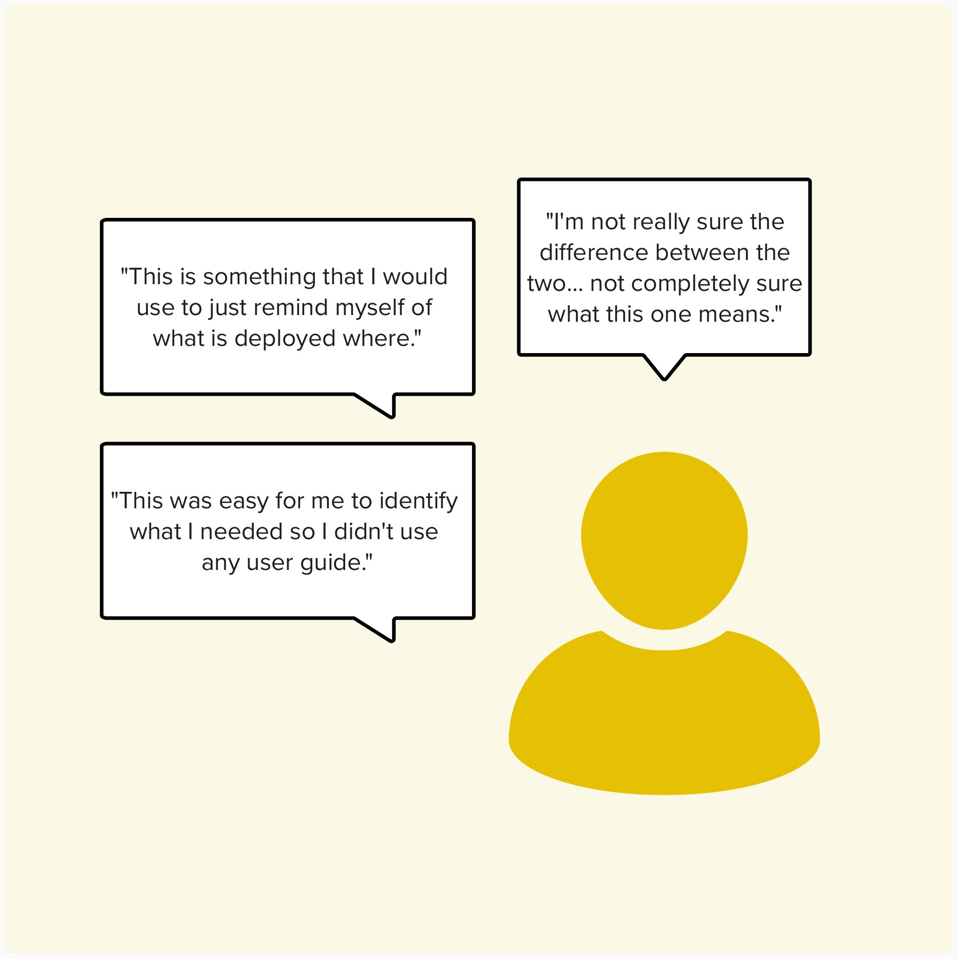
We needed qualitative insights on the dashboard’s performance to see if any major problems required our attention. I recruited and moderated a 6 tests where users were asked to complete tasks and answer questions. Users shared their understanding of the dashboard and explained why they did or didn't use it in their daily work. The tests helped us connect with users and uncovered improvement opportunities that would have never been shared otherwise
-
This was the most exciting part of the project for me. The developers did not need any coaxing into participating in the usability tests as observers/note-takers. They were on top of follow-up questions and they always had ideas for how they could address the feedback, sometimes jumping right into building it!
Data Synthesis
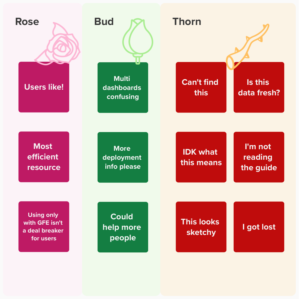
I combined the quantitative and qualitative data, identifying patterns across multiple users. I presented the key findings to the team and lead them in an exercise to brainstorm UI changes that would address each topic, followed by a voting session. Everyone in the team contributed to the "Top 5" list of enhancements and had next steps for dashboard improvements.
Next Steps
At the end of my involvement in this project, the development team had clear direction for how they could make the dashboard a success. The team committed to making UI enhancements, marketing it better, and conducting further follow up research.
Enhancements
The dashboard could be improved with more information that could help users understand the usage and recency of certain data points.
Marketing
Research revealed that users do not know enough about the dashboard or how to access it. The team needs to strategize effective communications to the development group.
Further Research
After the next round of enhancements are put into effect, the team wants to repeat evaluative research steps to check how users respond to the updates.
Reflections & Learning
The team that took on this project primarily delivered technical work. UI and UX research was uncomfortable territory at the start, but by the end their apprehension was replaced by excitement. I was so impressed by their participation in each new activity, without that open-mindedness this project would have been dead in the water.
Functioning as the project manager with a multi-disciplinary team was an exciting opportunity. I was able to lean on my past UX project experience to help lay out the roadmap and I made sure to simplify activities and include time for knowledge sharing. Because my focus was primarily with the research activities, I think there were bumps in the road with the UI design that I would approach differently in the future. These lessons learned will be applied moving forward.
Compliance Roadmap
Although 508 compliance was kept in mind throughout the project, I wish I didn’t take that burden on alone. Next time I would seek out subject matter experts on or off the project to understand what unique compliance needs or processes are involved with developing a new tool.
New UI Guide
The user interface used React components from the USWDS. Although most of the UI was not custom, next time I would take the extra time to document the UI component usage more thoroughly so that it was clear which ones are in use and the usage rules.